kettenbrücke
CONCEPT | BRANDING | ILLUSTRATION
Living health. Celebrating design.
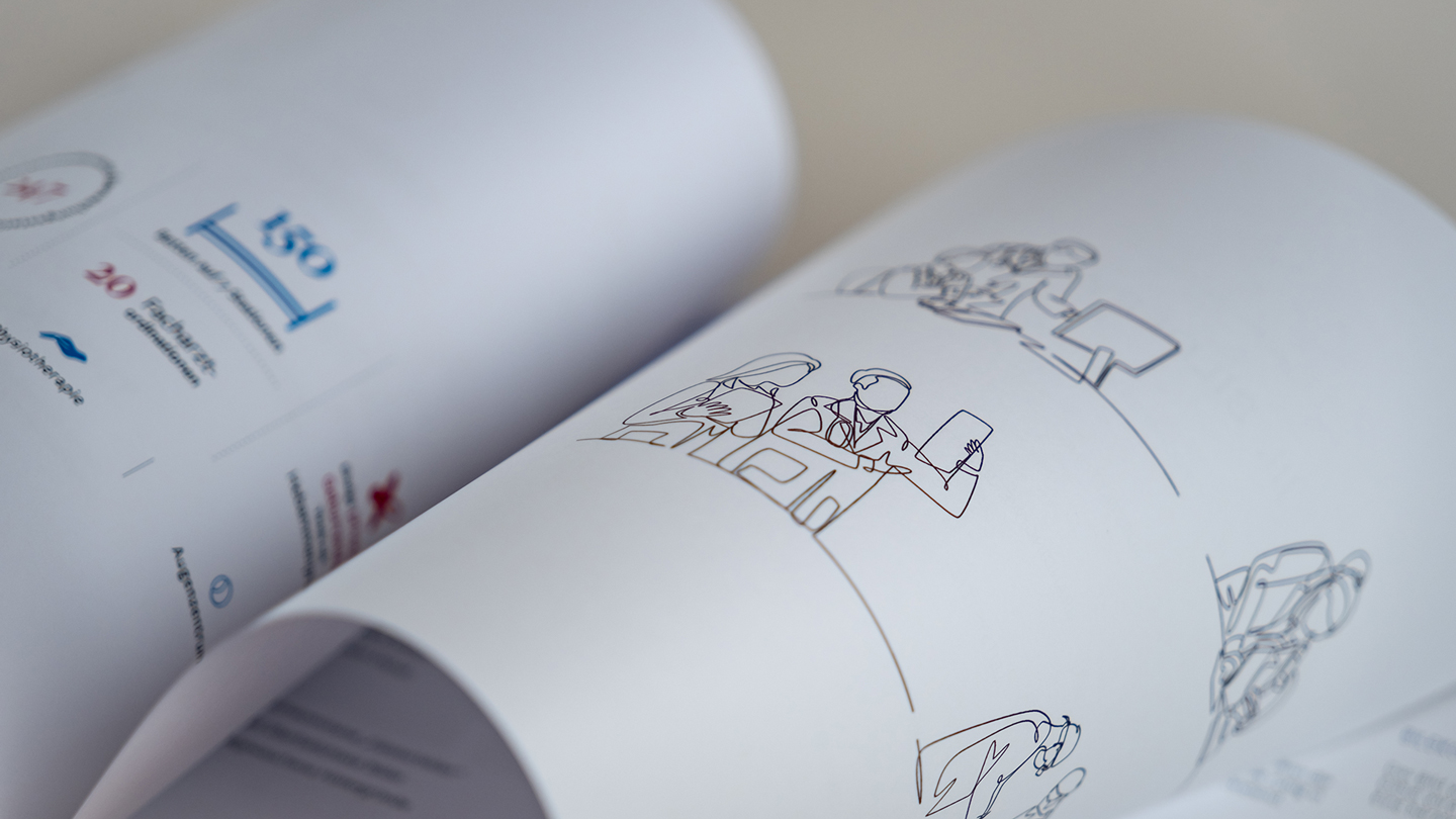
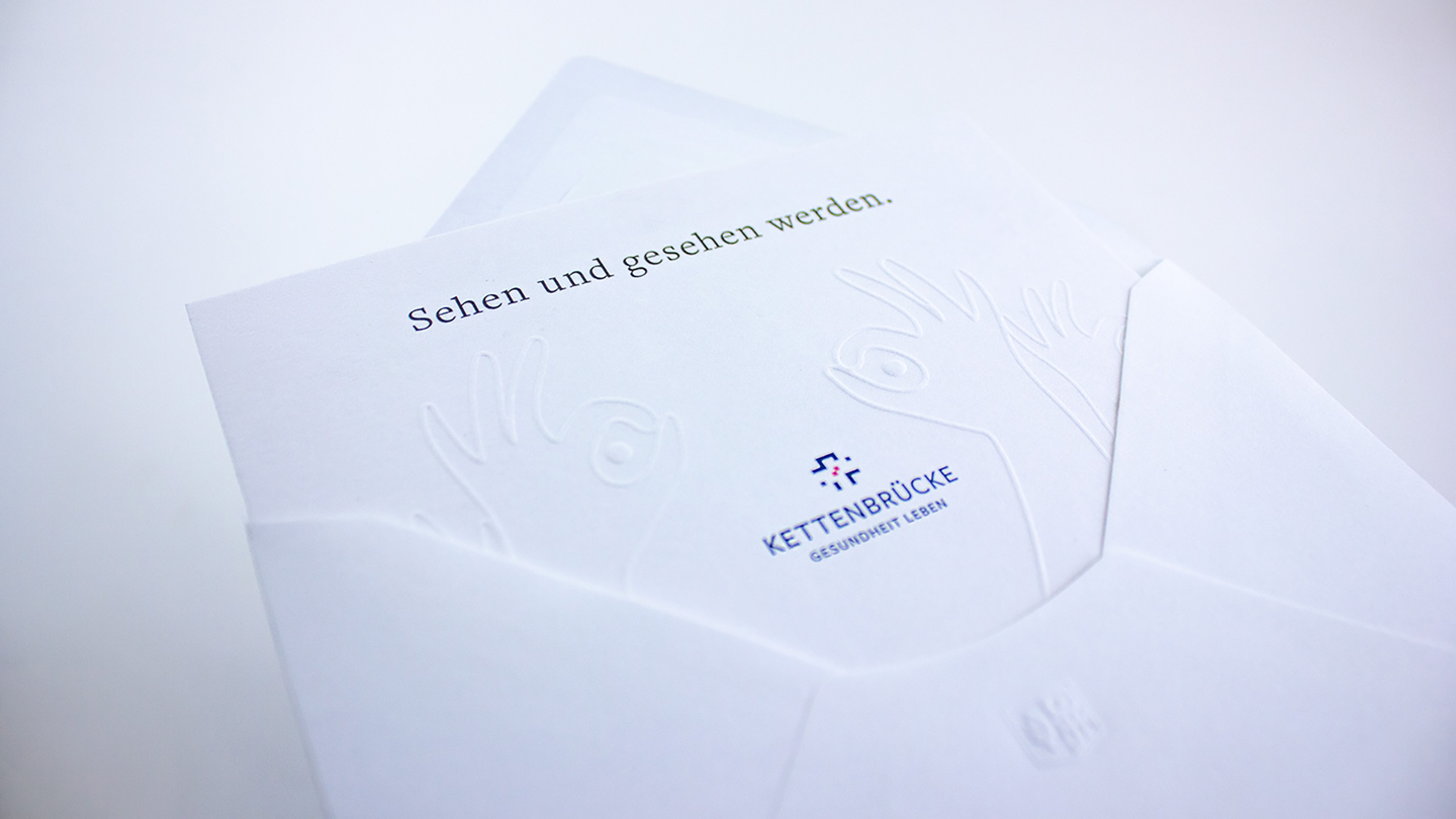
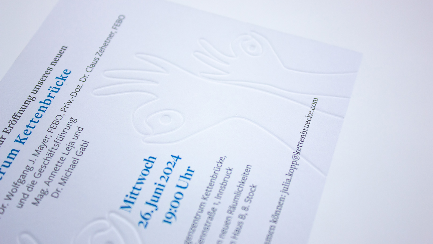
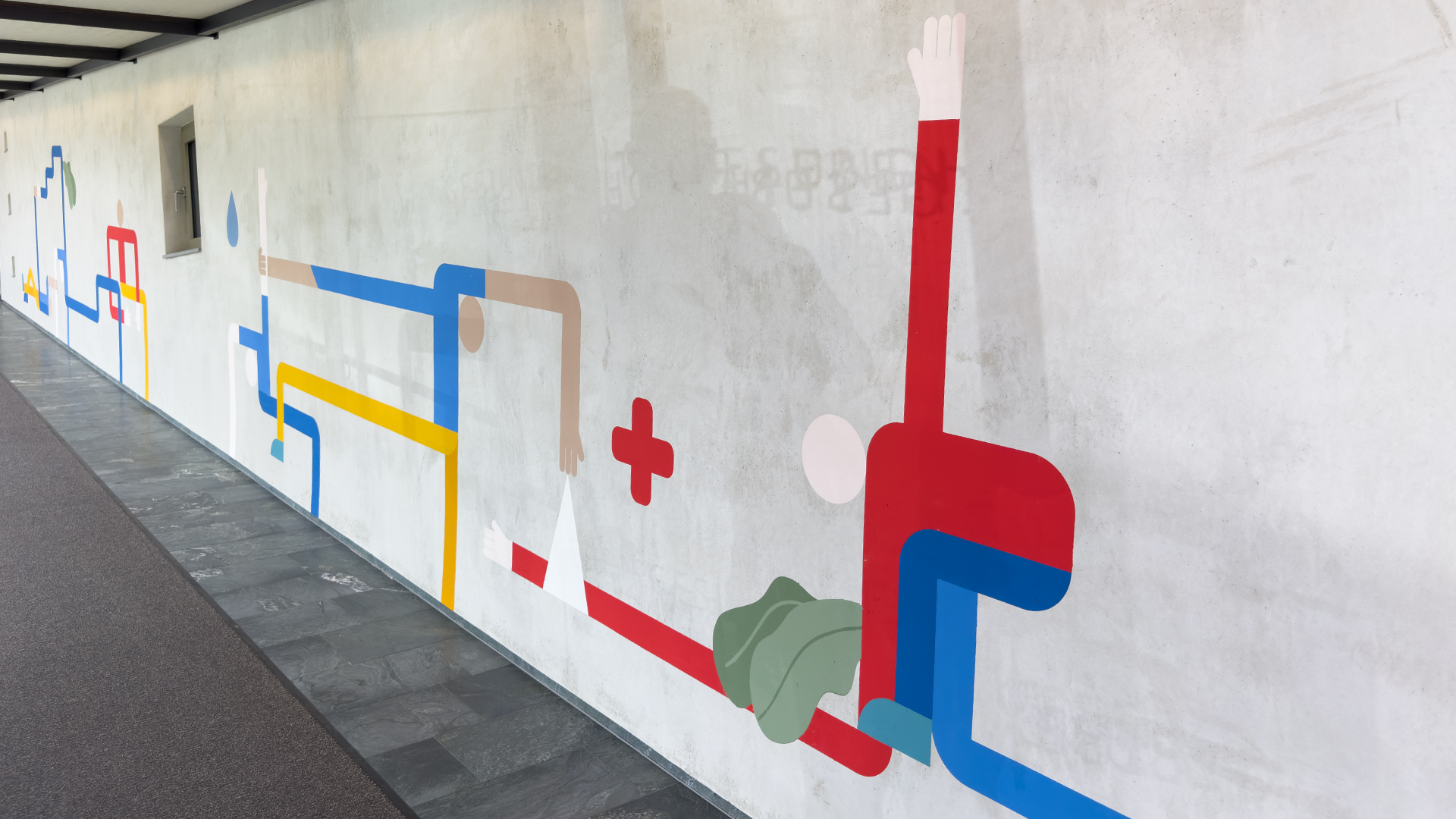
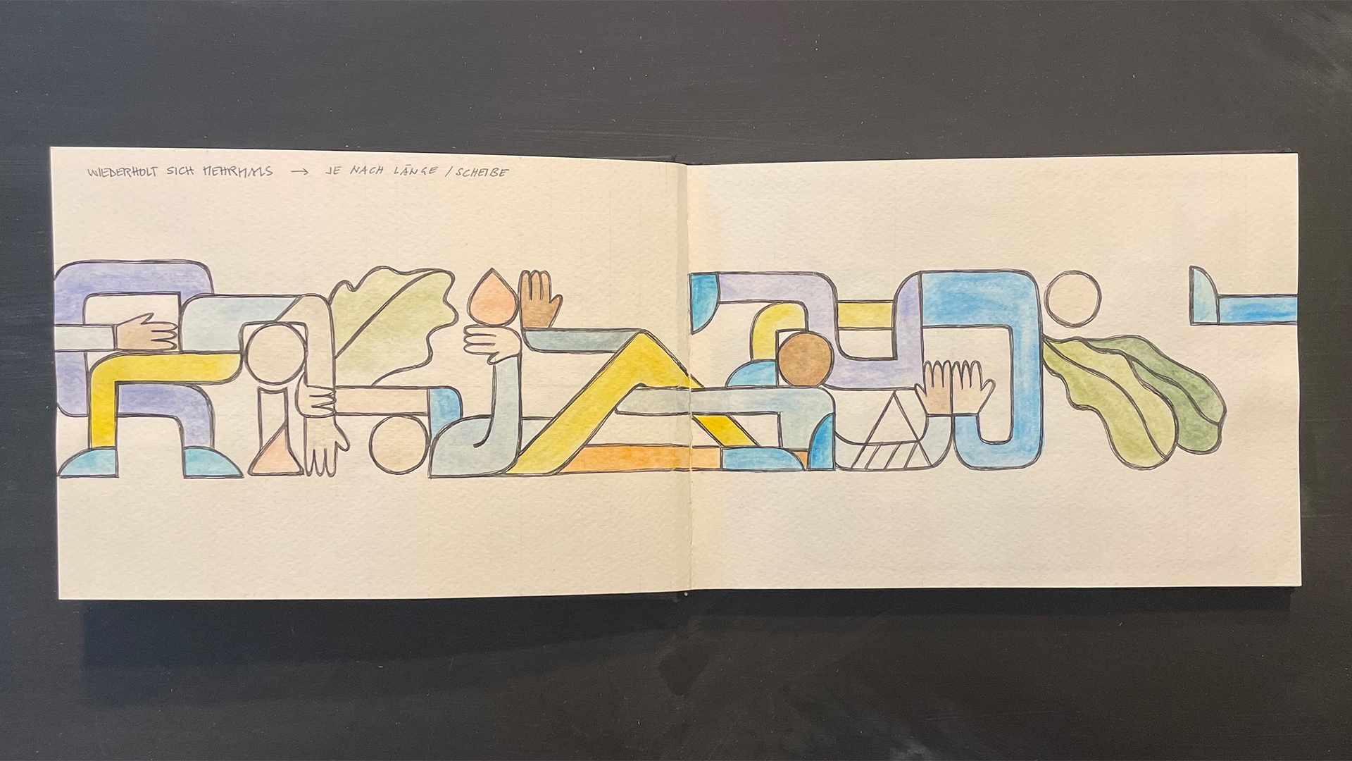
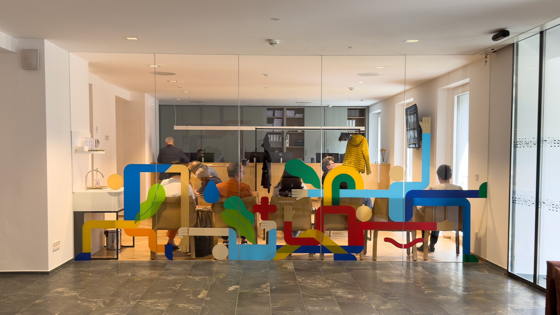
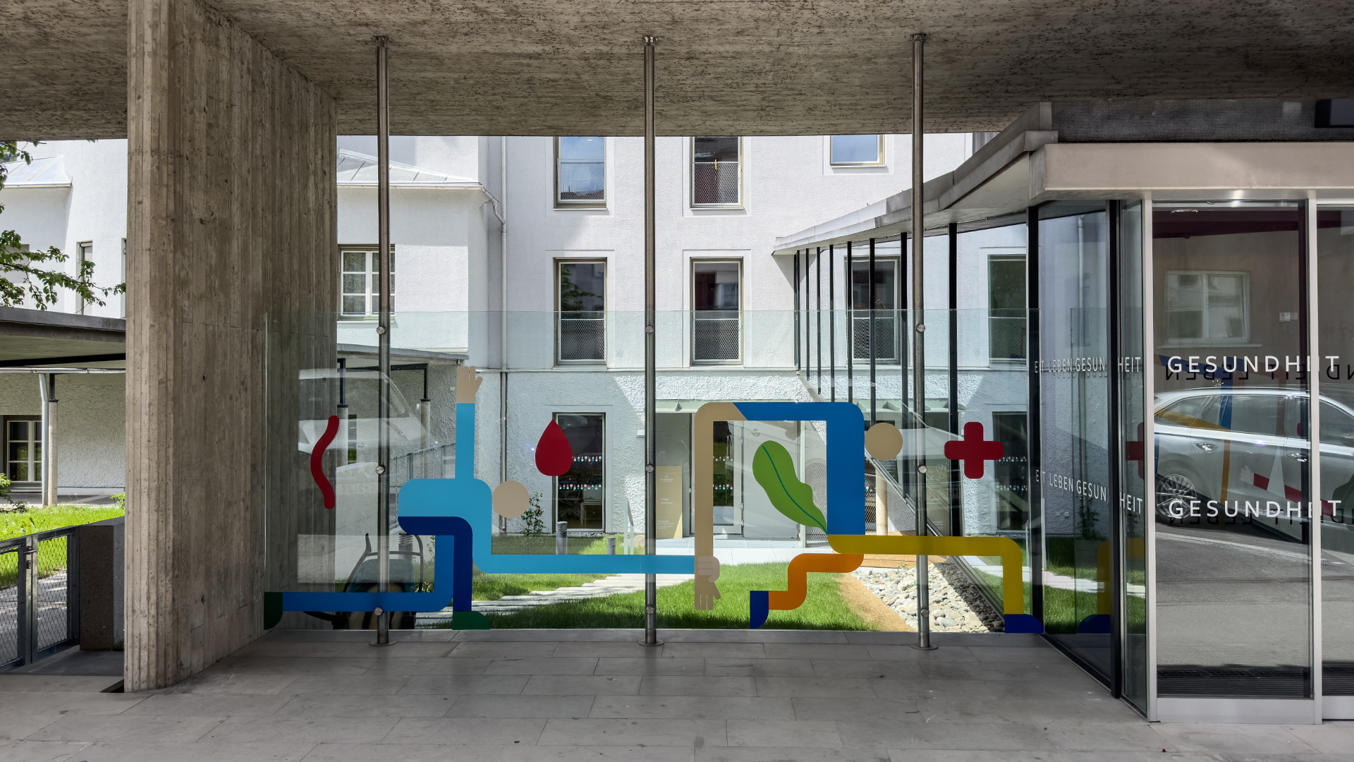
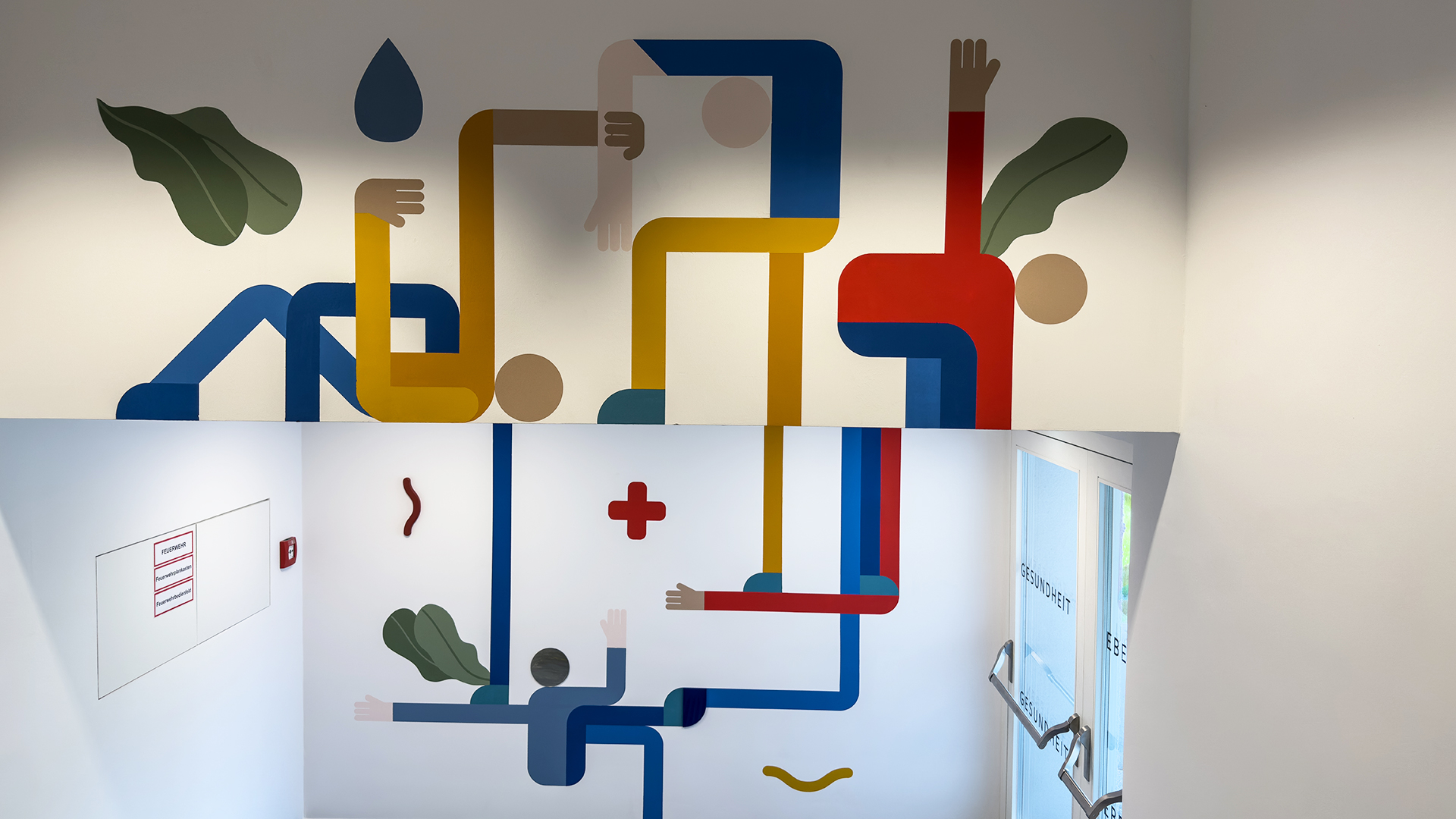
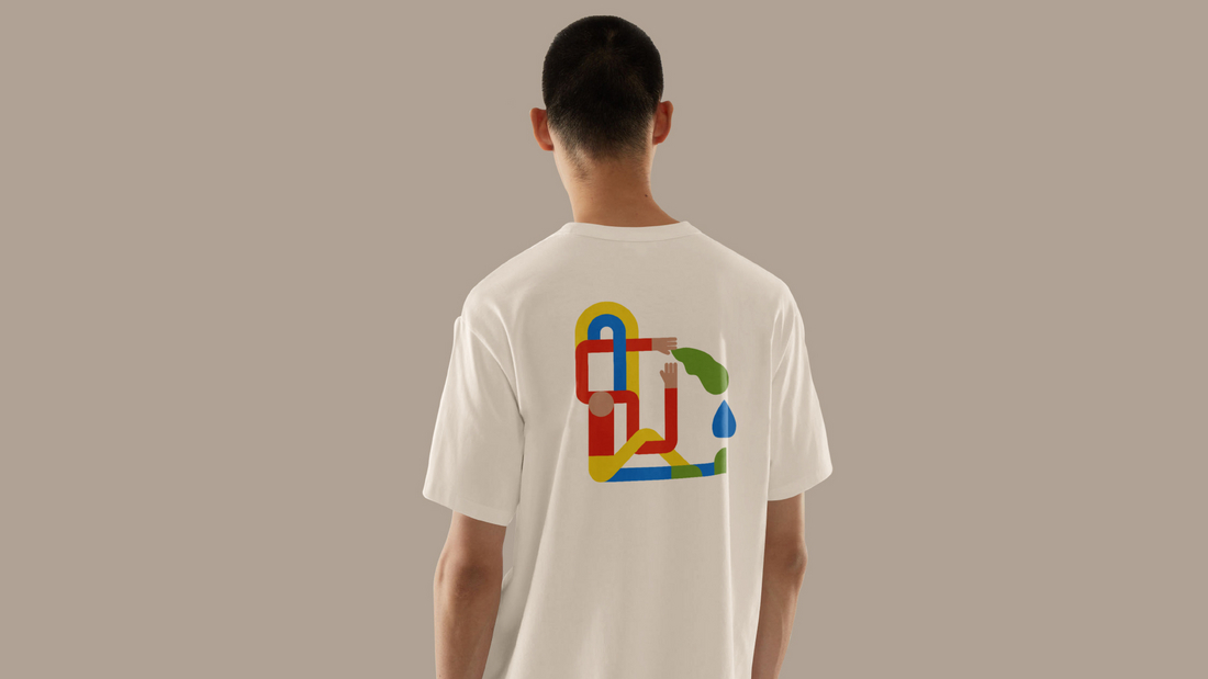
The branding for the new "Haus C" at Privatklinik Kettenbrücke in Innsbruck is a true design highlight. We brought the connection between the slogan "Living health" (Gesundheit leben) and the facility’s services to life. The graphic design focuses on the interplay between two elements: cutting-edge medical excellence and personal care; concrete and glass surfaces; geometric and organic shapes. This resulted in a versatile illustration of these forms within a design grid. Furthermore, the graphics were made tangible through haptic elements such as wood and mirrors. A particularly impressive feature is the design of the long glass ribbon in the outdoor area, where the artwork was applied directly onto the glass panes using a specialized printing technique.
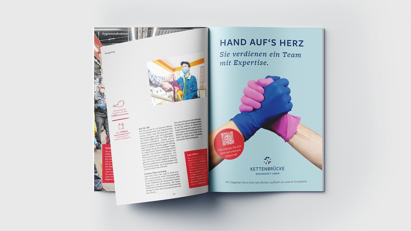
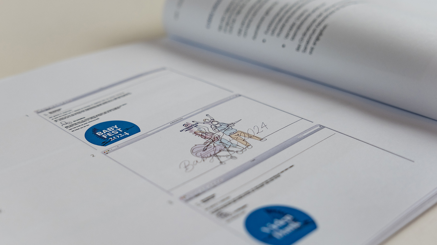
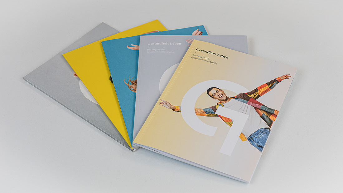
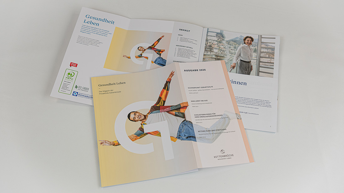
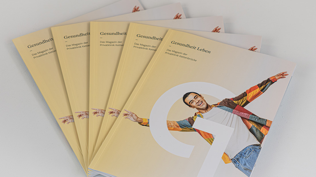
A magazine full of health
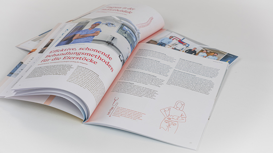
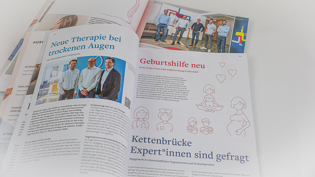
The fifth edition of the Gesundheit Leben magazine by Privatklinik Kettenbrücke has arrived. Once again, we were responsible for both the editorial content and the design. The layout reflects the recent brand and corporate design refresh, while the content highlights the medical specialties of the Innsbruck-based private clinic, combined with many useful health tips from their experts.

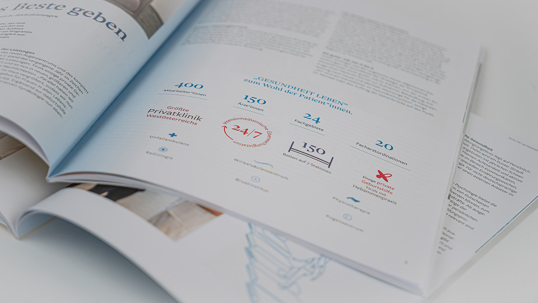
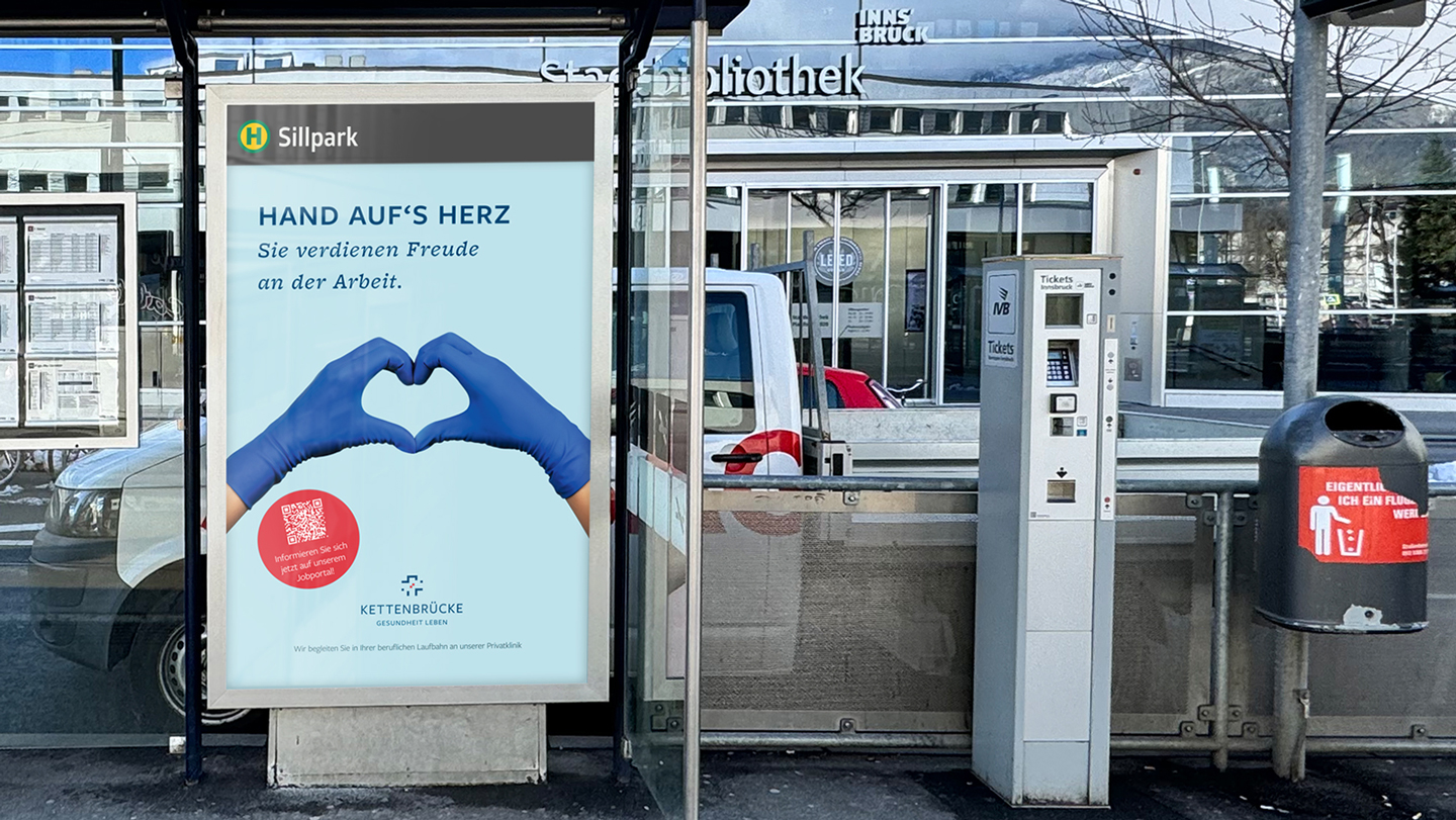
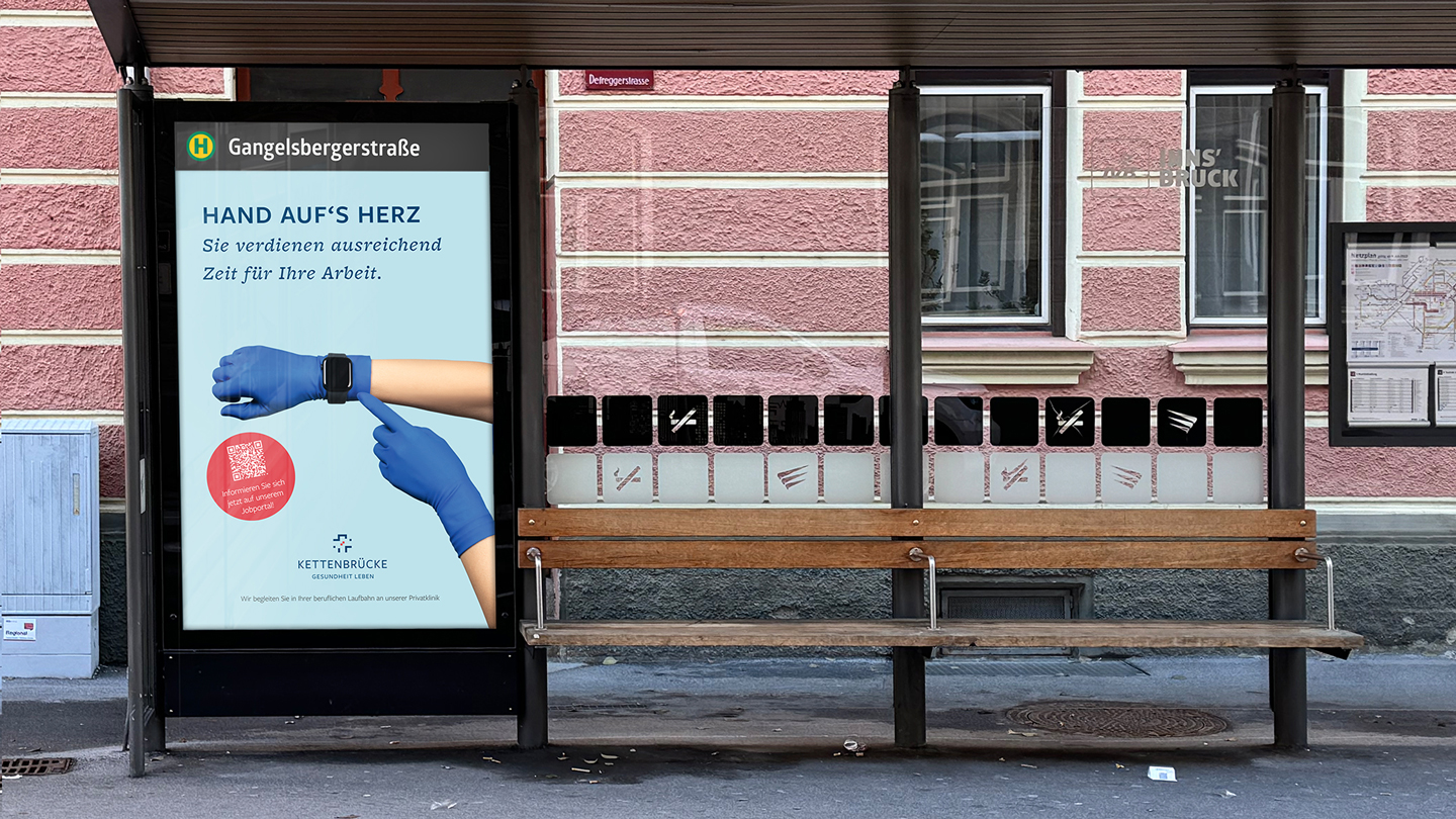
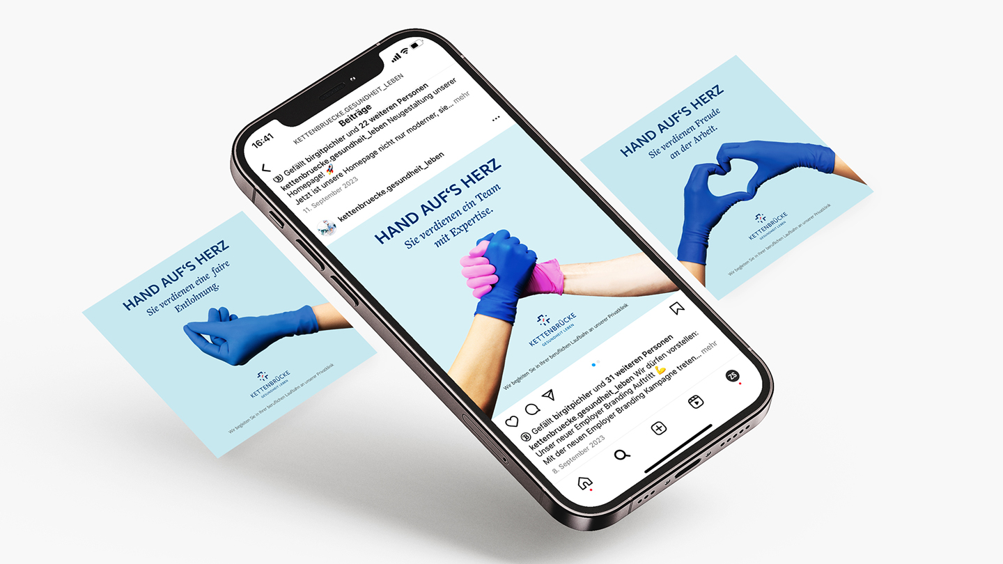
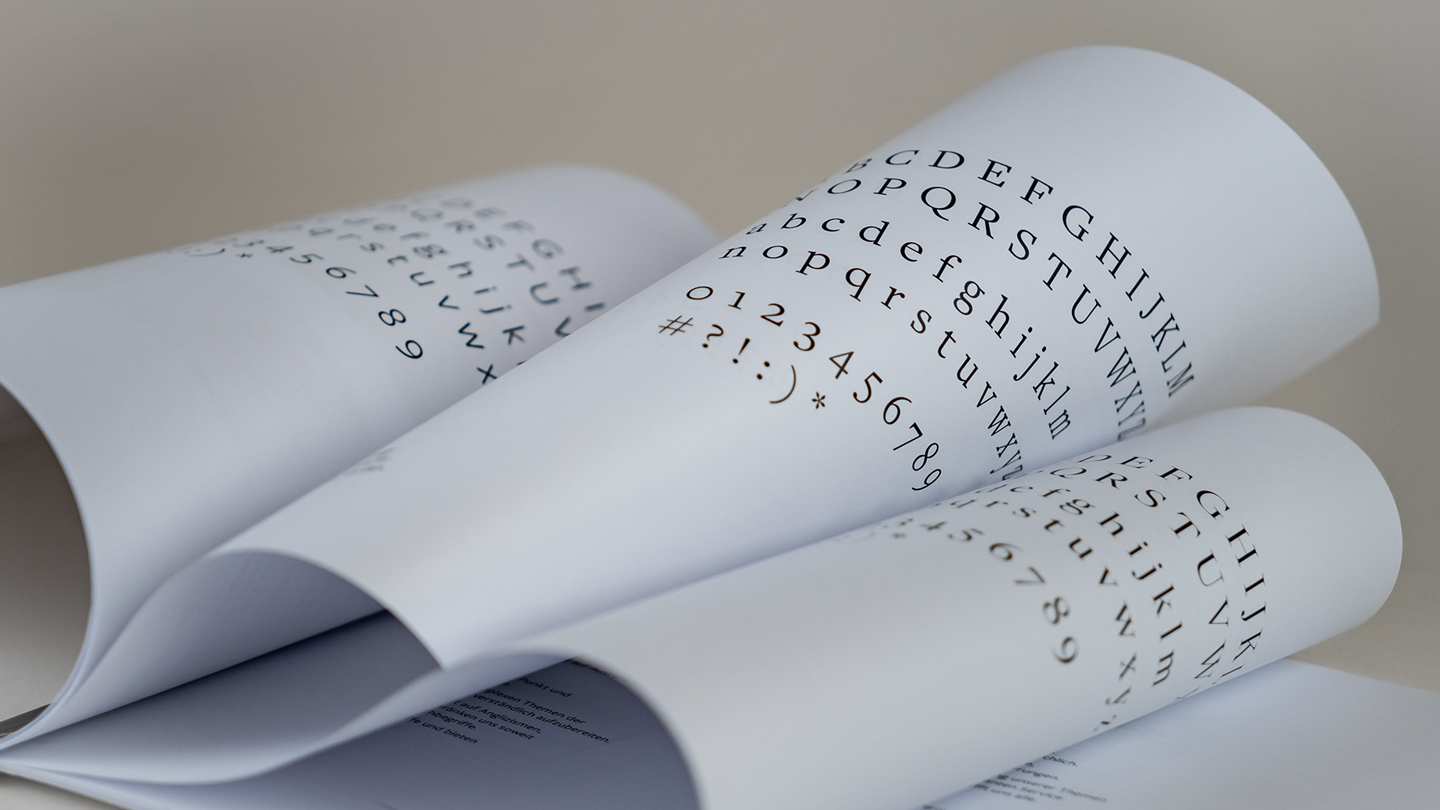
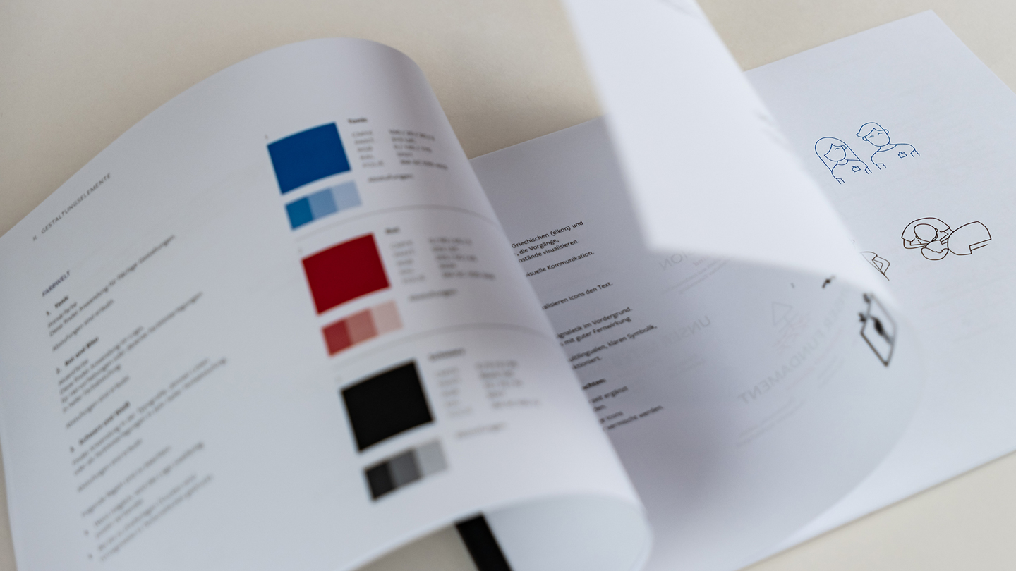
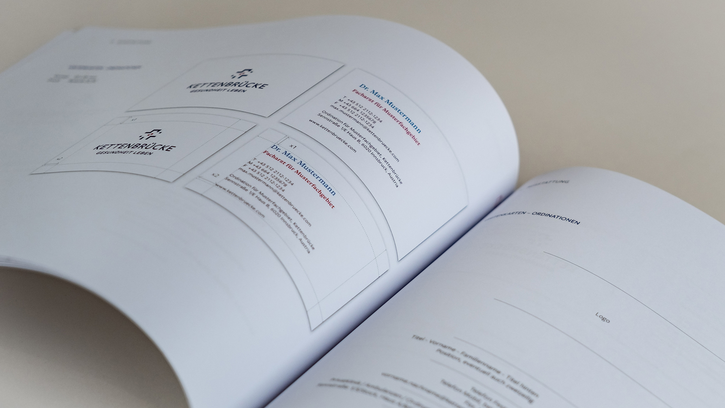
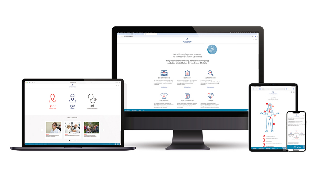
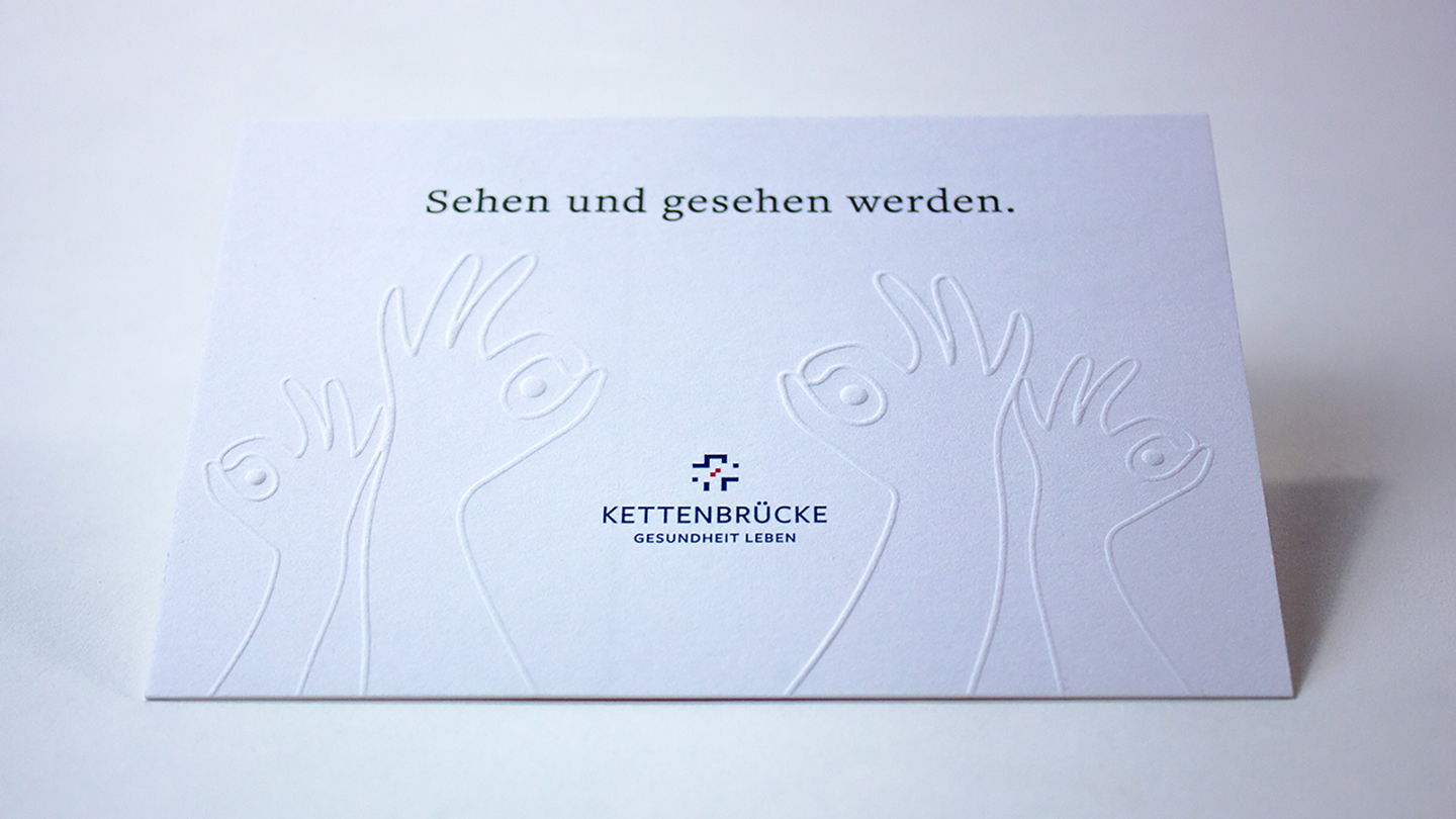
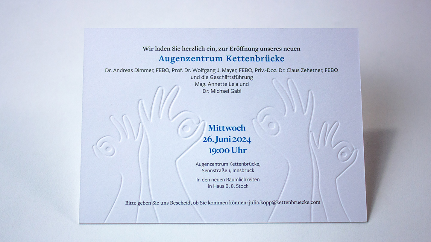
Privatklinik Kettenbrücke – Corporate Design Relaunch for a New Image
Over the past few years, Privatklinik Kettenbrücke – formerly Sanatorium Kettenbrücke – has undergone a significant transformation. Its range of high-end medical services has grown, with highly complex surgeries now being performed at the Innsbruck private clinic, establishing it as a key regional provider. The goal was to reflect this evolution in the branding through a corporate design relaunch, including an update of the brand and brand architecture. We were honored to lead the project in terms of brand strategy and design. Now, the brand identity convincingly communicates the innovative services offered by Western Austria’s largest private clinic.