Innsbrucker Verkehrsbetriebe
Corporate Design | Campaign | Branding
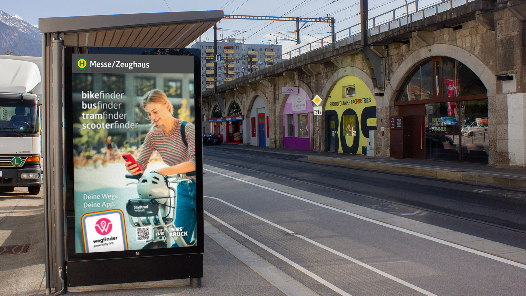
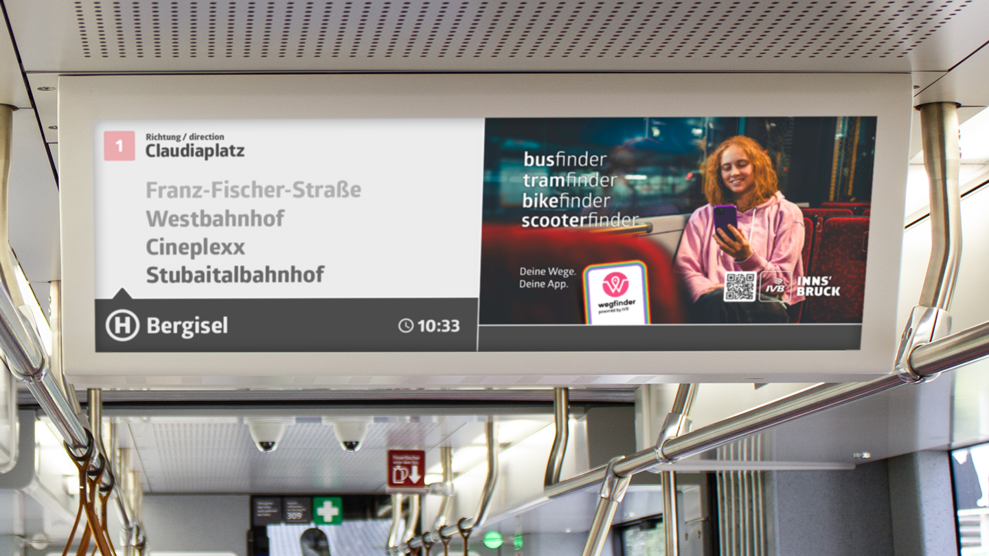
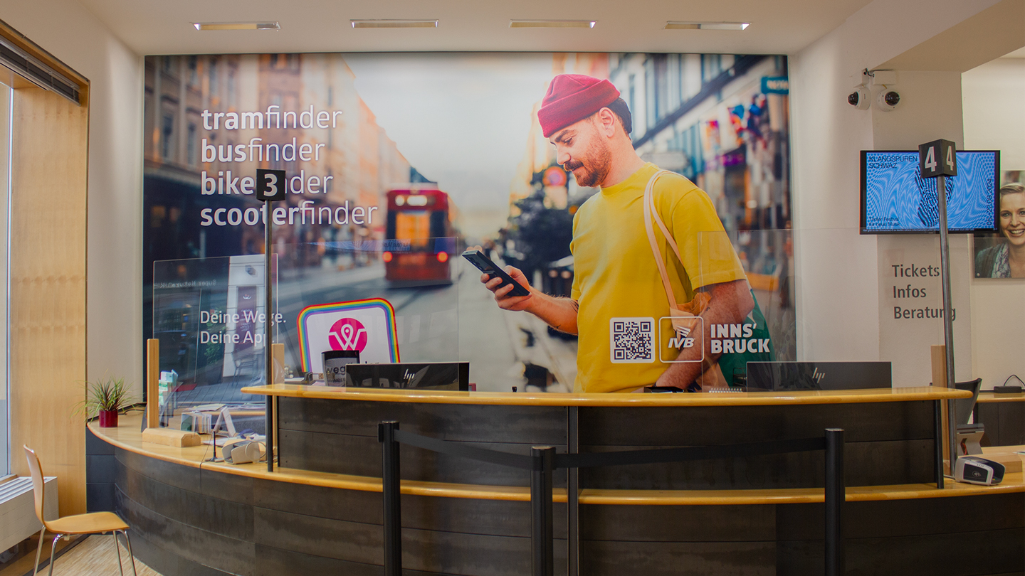
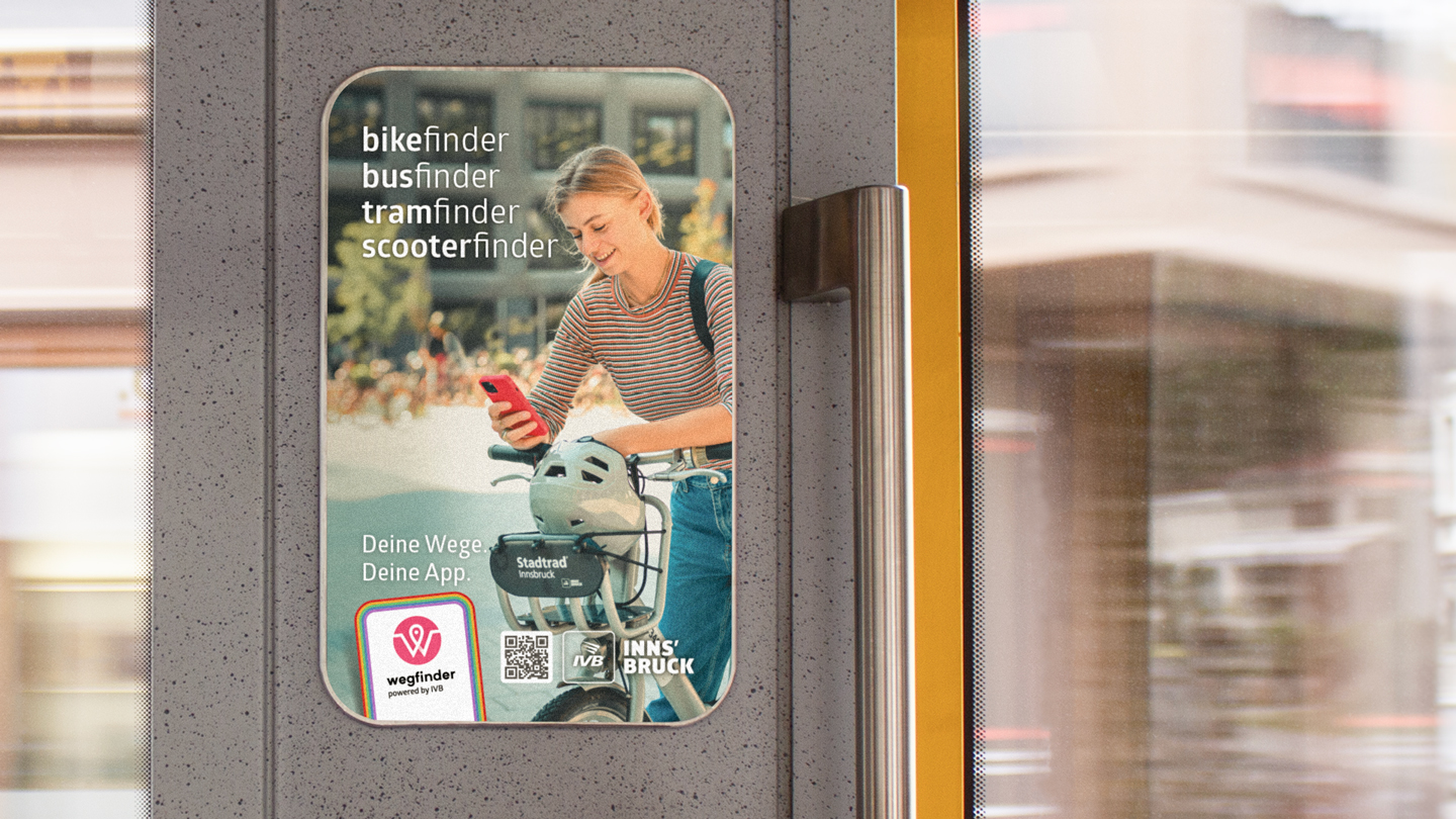
campaign finder
wegfinder
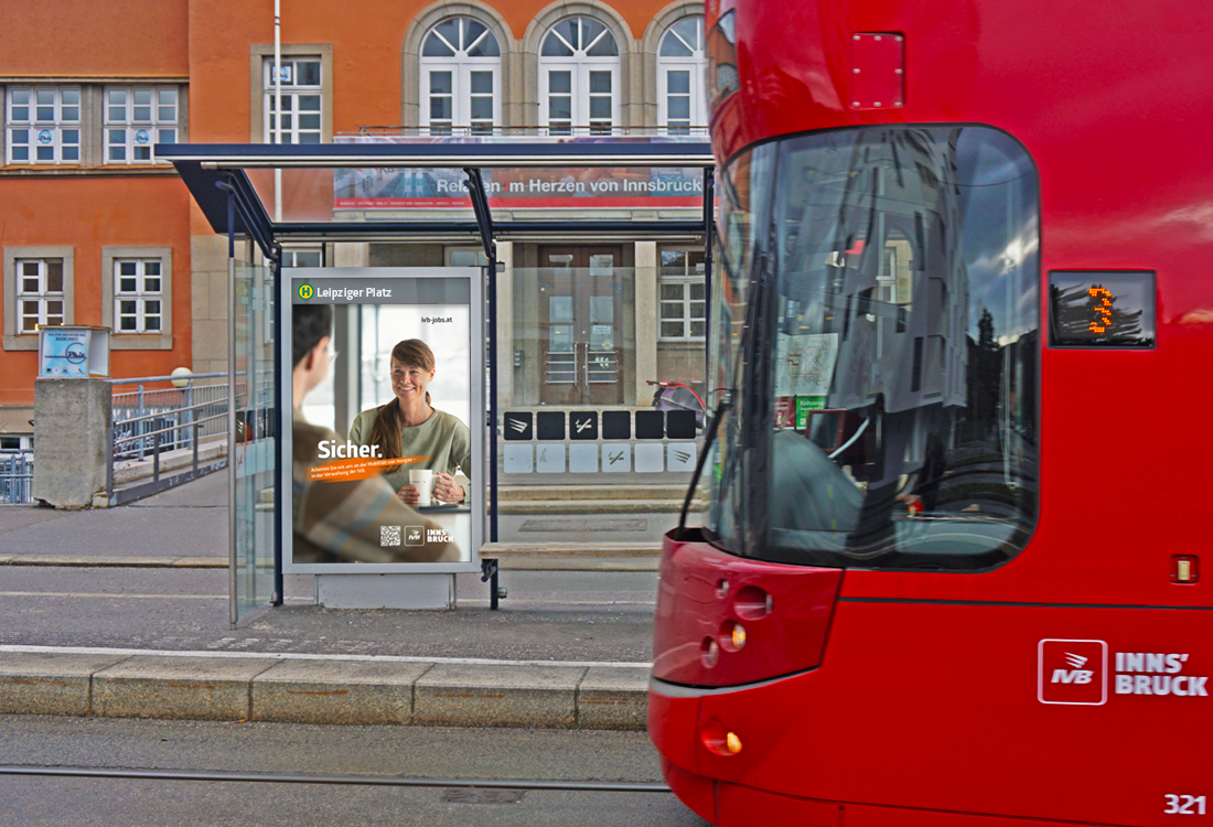
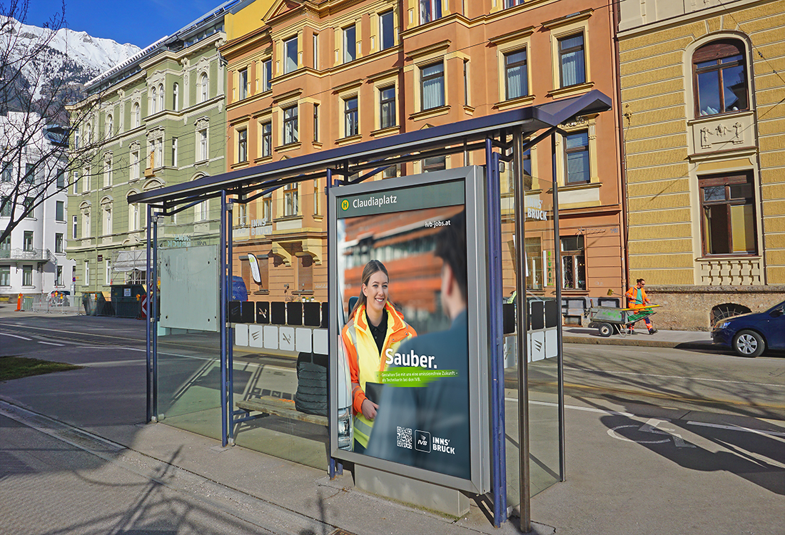
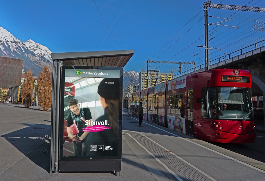
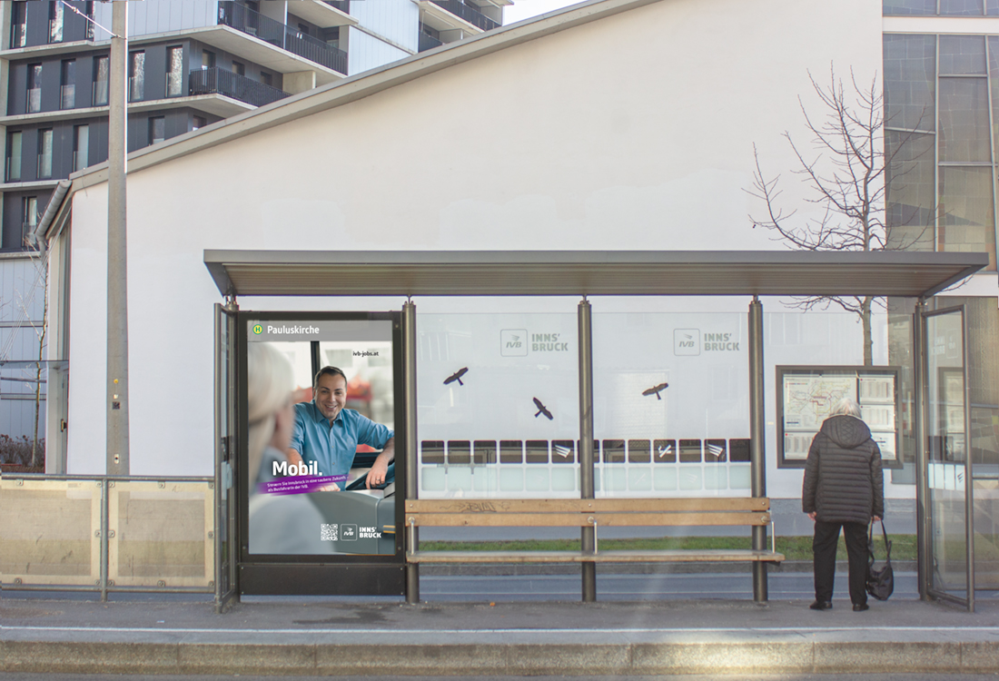
One of the central messages of the Innsbrucker Verkehrsbetriebe brand is simplicity. One app for everything. One app for all our routes. The wegfinder campaign expresses this clarity and conciseness. We show real people in real life. The imagery is personal, colorful and authentic.
Kampagne wegfinder
Eine der zentralen Botschaften der Marke Innsbrucker Verkehrsbetriebe ist Einfachheit. Eine App für alles. Eine App für alle unsere Wege. Die wegfinder-Kampagne bringt diese Klarheit und Übersichtlichkeit zum Ausdruck. Wir zeigen echte Menschen im realen Leben. Die Bildwelt präsentiert sich persönlich, farbenfroh, authentisch.
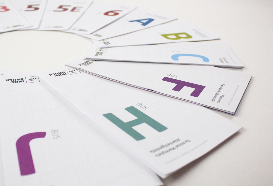
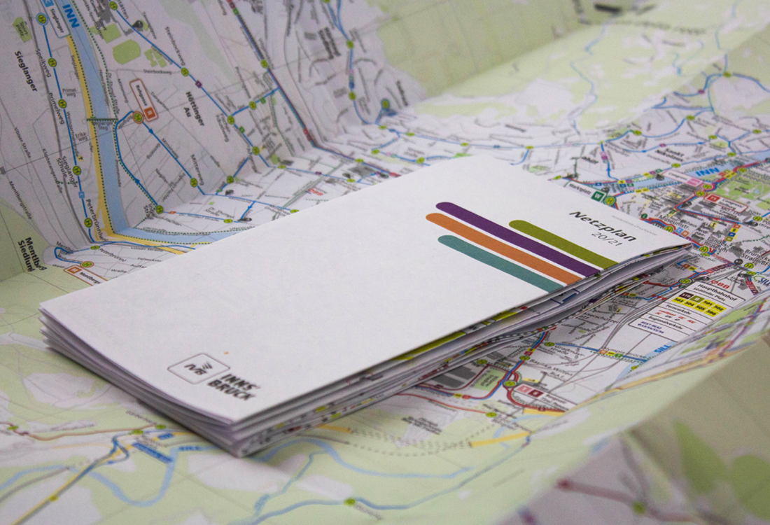
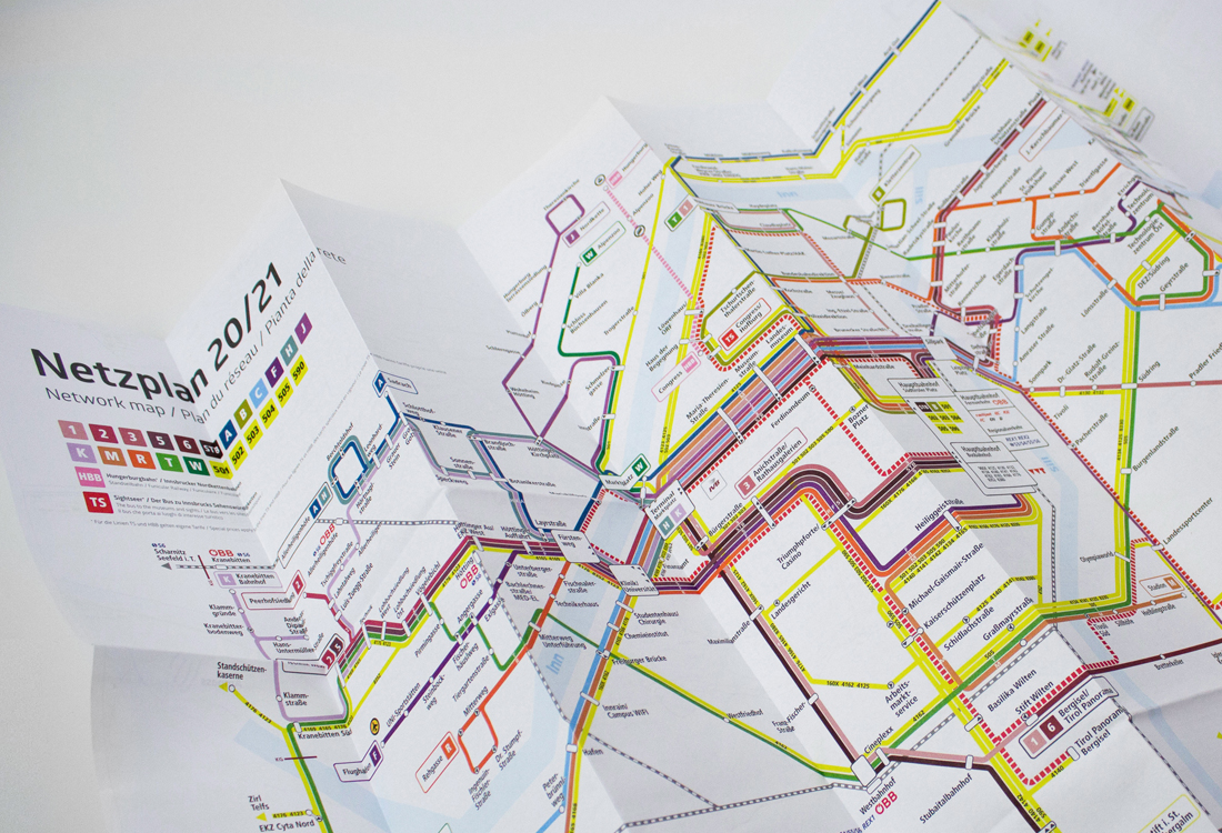
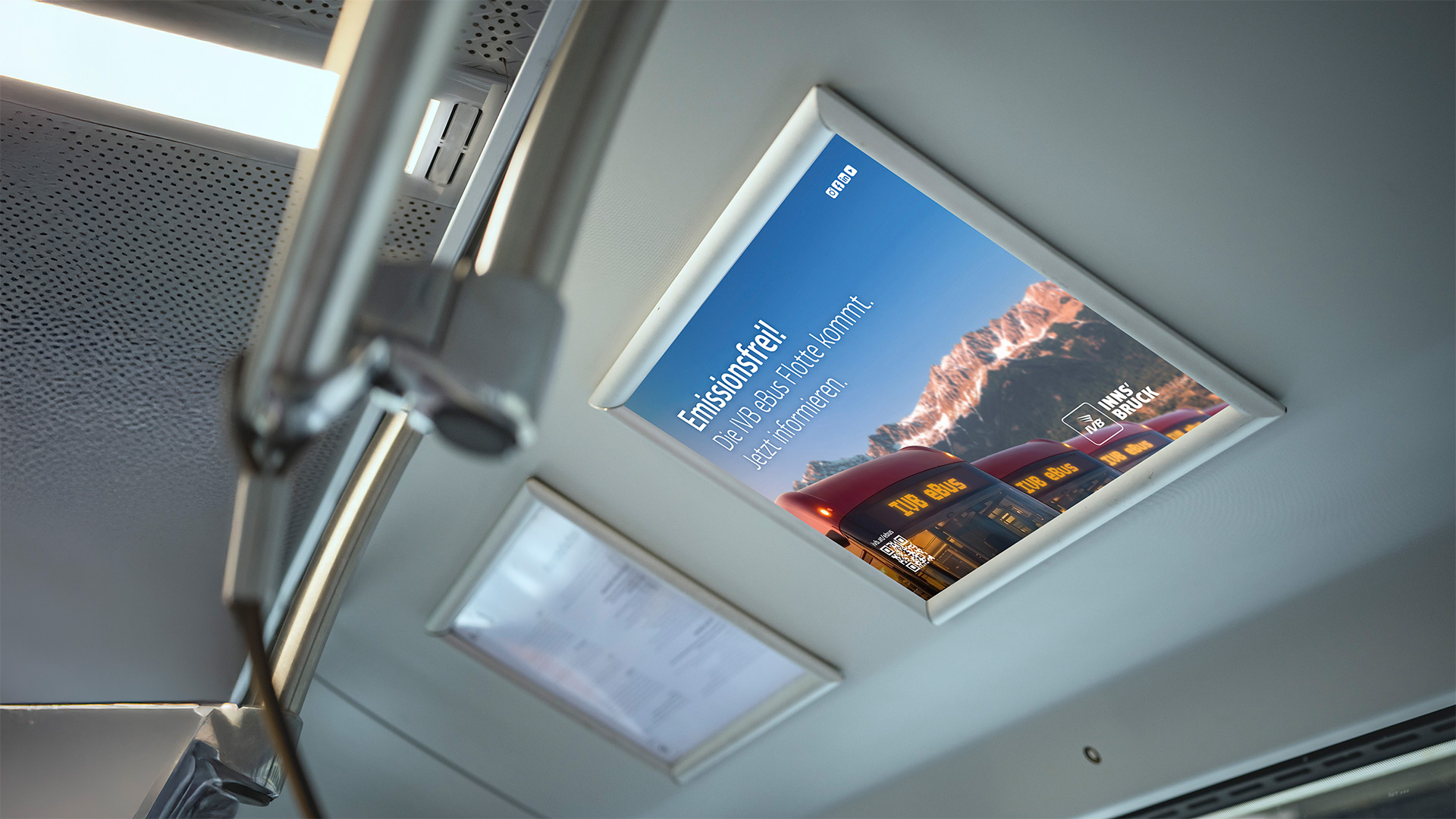
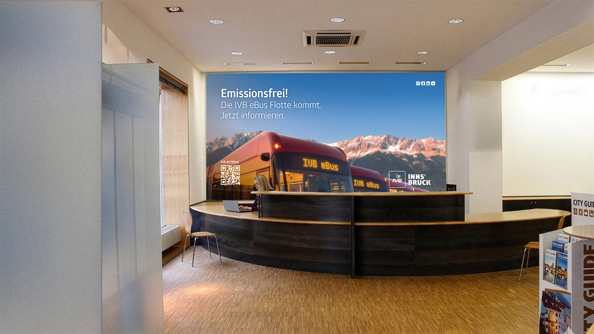
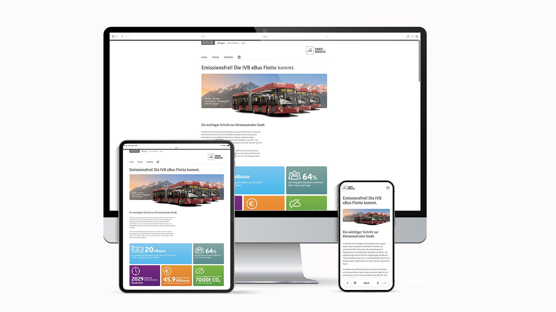
Corporate Design - Less Is More
Simplicity is one of the key messages defining the brand of local transport company Innsbrucker Verkehrsbetriebe. Correspondingly, emphasizing the true essentials clearly helped outline the creative design of the communication tools in use. Clarity and comprehensibility shape the general visual appearance while the wording represent a certain sense of understatement.
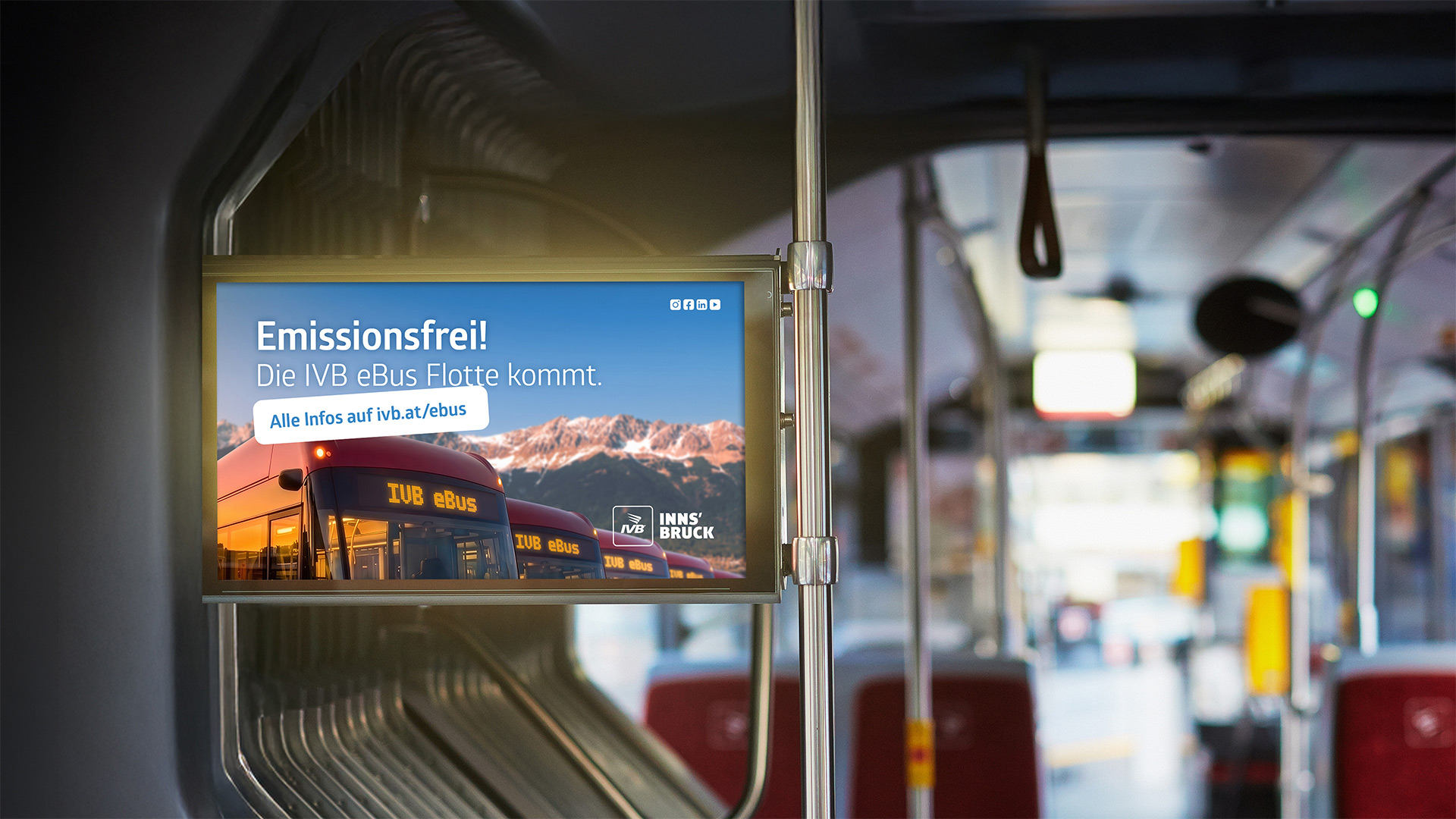
All icons and creative elements follow this approach. Besides white, the only main colors are ruby-red and traffic yellow in combination with jet black and iron-gray. Thus, core traits such as emotion, warmth and passion can naturally be combined with elegant design solutions. Based on this, a number of additional colors is deployed to meet a diverse range of creative demands. The general imagery comes across as both authentic and personal. Instead of contrived sceneries and stylish models, we show real people in every-day situations. Close-ups emphasize human emotions. A playful approach to definition while occasionally blurring it, redirects the focus to the essentials. The corporate design characterizes the key values of the brand, communicating the quality standards of modern-day urban mobility to the target group.